
Short answer (updated 28 Oct 2026, pass 5): There is no single "original" Great Wave. Katsushika Hokusai's Under the Wave off Kanagawa (Kanagawa oki nami ura), from the series Thirty-six Views of Mount Fuji, ca. 1830–32, is a woodblock print, made in editions. Museums hold many separate impressions, and they differ in color, wear and size. The Met alone catalogues four: JP1847, JP10, JP2569 and JP2972. Our print reproduces one specific sheet, The Met's JP1847 from the H. O. Havemeyer Collection. (The Metropolitan Museum of Art)
The fact gap: one image, many sheets
| What people assume | What the record says | |
|---|---|---|
| Is there one original? | A single painting hanging in a museum | A woodblock print, ink and color on paper, printed in editions. Each museum sheet is its own impression. (The Met) |
| How many at The Met | One | Four catalogued impressions: JP1847 (Havemeyer, 1929), JP10 (Rogers Fund, 1914), JP2569 (Howard Mansfield Collection, 1936) and JP2972 (Henry L. Phillips Collection, 1939). (The Met) |
| How many were printed | A small, rare edition | The British Museum estimates that between 5,000 and 15,000 copies were printed in the Edo period, all by hand, so no two are identical. Its scientist Capucine Korenberg has located 111 surviving impressions. The British Museum holds three Edo-period impressions and the Met four. (British Museum) |
| Size | A large wall picture | About 25–26 × 36–38 cm. JP1847 is 25.7 × 37.9 cm (10 1/8 × 14 15/16 in.), roughly a magazine spread. The four Met sheets differ by a centimeter or two. The British Museum's impression 1906,1220,0.533 measures 24.6 × 36.8 cm. (The Met; British Museum) |
| Title | "The Great Wave" | The Met's title is Under the Wave off Kanagawa (Kanagawa oki nami ura), "also known as The Great Wave." (The Met) |
| Date | A single year | ca. 1830–32, Edo period. Hokusai lived 1760–1849, so he was around seventy. (The Met) |
The four Met sheets, side by side
Same design, four physical sheets. Compare the sky, the paper tone and the strength of the blues. (Images: The Met, Open Access, CC0)
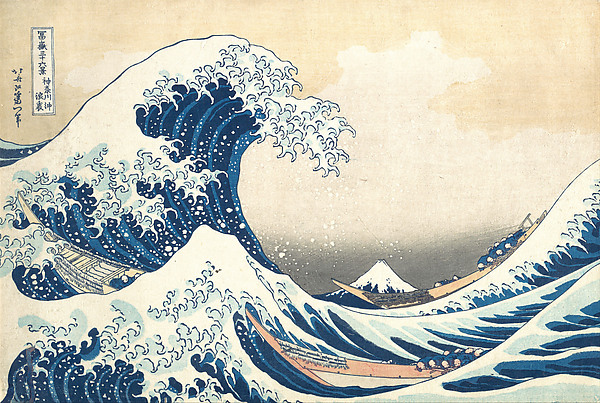 JP1847 · 25.7 × 37.9 cm · Havemeyer, 1929 · our print |
 JP10 · 24.4 × 35.7 cm · Rogers Fund, 1914 |
 JP2569 · 25.4 × 38.1 cm · Mansfield / Rogers Fund, 1936 |
 JP2972 · 25.1 × 37.8 cm · Phillips bequest, 1939 |
Why the blue looks the way it does
The Met's essay "The Great Wave: Anatomy of an Icon" reports that the publisher Eijudo advertised the series for the New Year of 1831 as featuring a pigment newly available to the print market: Prussian blue. Spectroscopic analysis cited there shows the printers did not simply swap it for indigo. They mixed the two for the dark outlines and stripes, then printed pure Prussian blue over them in the hollow of the wave, so the blue darkens without losing intensity. (The Met, Heilbrunn essay)
A second museum's lab, same answer
The British Museum ran its own pigment analysis (false-colour infrared and XRF) on its Great Wave before its exhibition Hokusai: beyond the Great Wave. Indigo printed the outlines, the title cartouche, the signature and the dark areas of the wave. Prussian blue printed the medium blue. The ink for the light blue was still undetermined. Arsenic on parts of the boats suggests the yellow pigment orpiment. The museum adds that Prussian blue reached Japan through China and the Netherlands, the only countries Japan then traded with. Two labs looked at two different sheets, and both found indigo and Prussian blue used together. (British Museum)
The same museum's research compares small differences between surviving impressions to work out the order in which sheets were printed. Its catalogue dates its own impression "probably late 1831." (British Museum)
Early and late: how the blocks wore out
The British Museum's scientist Capucine Korenberg dates impressions by woodblock wear. Prints aren't dated or numbered, but the fine ridges of the outline block broke over time, so sheets with lines missing came later. (British Museum, "The Great Wave: spot the difference," 2020)
- Where to look: three breaks appear in the double frame of the title cartouche, plus breaks in the outline of Mount Fuji and of a wave on the right. A print with no breaks is an early printing. (British Museum)
- Why early matters: experts believe the artist chose the colours and printing effects only for the early printings; later the publisher made changes to appeal to buyers or cut costs. (British Museum)
- Late printings look different: a more colourful sky, sometimes grey inked to suggest rain, and two new, cruder blocks: one for the light blue in the sea (more angular shapes) and one for the boats' yellow, with some boats left white. The very last printings have pink boats and dark brown clouds. (British Museum)
- The publisher: Nishimuraya Yohachi, known for high standards. A letter of 1836 records his money troubles in the mid-1830s, one possible reason for the cheaper replacement blocks. (British Museum)
- Price then: about the same as two helpings of noodles in the mid-19th century. Before Prussian blue arrived, printmakers used the far less vivid indigo and dayflower blue. (British Museum)

A late printing: Art Institute of Chicago 1952.343 (Clarence Buckingham Collection, 25.4 × 37.6 cm), the sheet the British Museum uses to show the order of the block breaks. CC0. Not the sheet we print. (AIC; British Museum)
Four details worth looking at
- Fuji in the trough. In a series named for the mountain, the peak is a small cone framed by the hollow of the wave. (Our reading of the Met image)
- Claws of foam. The crest breaks into finger-like spray that reaches down toward the boats. (Our reading)
- The step in the blue. According to the Met, double printing in the hollow of the wave leaves the foam, the bright blue and the deep blue at slightly different heights on the paper. If you hold a real sheet, you can feel a step at each colour. (The Met, Heilbrunn essay)
- Paper tone and wear. On the Havemeyer sheet the paper has aged warm, and the blues and sky look softer. Comparing it with the other three Met sheets, and with the late Chicago printing above, shows how much impressions vary. (Our reading of Met and AIC images)
Context
- The series Thirty-six Views of Mount Fuji (Fugaku sanjūrokkei) is catalogued by The Met with several sheets in its Asian Art department. (The Met)
- Works on paper like this are light-sensitive and are shown only now and then. None of the four Met impressions currently lists a gallery number. (The Met)
- The Met marks JP1847 as public domain under Open Access. (The Met)
- Claude Debussy kept a framed Great Wave in his studio and chose a cropped detail of it for the cover of the 1905 first edition of La Mer (A. Durand & Fils). (The Met, "Hokusai and Debussy's Evocations of the Sea")
Which print
Our print reproduces The Met's impression JP1847 (H. O. Havemeyer Collection, Bequest of Mrs. H. O. Havemeyer, 1929), from the museum's Open Access image DP130155 (CC0). It isn't a composite, a recut block or a recolored version. → Hokusai, The Great Wave off Kanagawa fine art print
Also from the dossier shelf:
- Water Lilies, 1906: Monet's pond at Giverny had a Japanese-style bridge.
- Cross, The Artist's Garden at Saint-Clair: another Met work on paper, with color laid down in separate touches.
FAQ
Where has this exact sheet been shown? The Met's impression JP1847 came from Louisine Havemeyer, who owned it until her death and left it to the museum in 1929. Its exhibition record runs from the Art Nouveau shows in Houston and Chicago in 1976 to the Royal Academy's Katsushika Hokusai in London (1991–92, also in Dallas in 1992), Nagoya in 1995 and Milan's Palazzo Reale in 1999–2000. It went to the Freer and Sackler in Washington for Hokusai: Thirty-Six Views of Mount Fuji (2012). At home it was in Discovering Japanese Art: American Collectors and the Met (2015) and Making The Met, 1870–2020 (2020–21). (The Met, JP1847, Provenance and Exhibition History)
What does the signature say? Just left of the title cartouche: 北斎改為一筆, Hokusai aratame Iitsu hitsu, "from the brush of Hokusai, who changed his name to Iitsu." He had taken the name Iitsu in 1820. (Museum of Fine Arts, Boston, 11.17652; RISD Museum 20.1195)
Is the wave a tsunami? Probably not. Physicists Julian Cartwright and Hisami Nakamura tested the tsunami idea against the alternatives, using the fluid dynamics of breaking waves. In their own summary, the wave is a plunging breaker, and "it is more probable that Hokusai intended to depict an exceptionally large storm wave", the kind now called a freak or rogue wave. They note the print is "today often reproduced as the artistic depiction of a tsunami." Bristol Museums, summarising their work, gives its height as about ten to twelve metres. (Notes and Records of the Royal Society 63, 2009, pp. 119–135; Bristol Museums Mb4452)
How can you tell an early impression from a late one? Look for breaks in the title cartouche's double frame and in the outlines of Fuji and a right-hand wave; early printings have none. Late ones also have a more colourful sky and sometimes pink boats. (British Museum)
Is there one original Great Wave? No. It's a woodblock print, so many impressions exist and museums hold different sheets.
How many exist? The British Museum estimates 5,000 to 15,000 were printed in the Edo period, and 111 surviving impressions have been located.
Which one does this print reproduce? The Met's JP1847, Havemeyer Collection, image DP130155.
How big is the real thing? JP1847 is 25.7 × 37.9 cm (10 1/8 × 14 15/16 in.).
When was it made? ca. 1830–32.
What is its real title? Under the Wave off Kanagawa (Kanagawa oki nami ura), from Thirty-six Views of Mount Fuji.
Why is the blue so strong? The printers mixed newly available Prussian blue with indigo and layered pure Prussian blue on top, according to spectroscopic analysis reported by The Met.
Is the image public domain? Yes. The Met releases it under Open Access (CC0). The museum does not endorse this shop.
Sources
- Museum of Fine Arts, Boston: Great Wave, 11.17652 (signature, about 1830–31, no publisher's mark)
- RISD Museum: Great Wave, 20.1195 (signature; early impression notes)
- Cartwright & Nakamura, "What kind of a wave is Hokusai's Great wave off Kanagawa?", Notes Rec. R. Soc. 63:2 (2009) 119–135 — authors' abstract read via Crossref, 28 Oct 2026
- Bristol Museums: Great Wave, Mb4452 (plunging breaker, 10–12 m)
- The Met — Hokusai, Under the Wave off Kanagawa, ca. 1830–32, JP1847 (Havemeyer)
- The Met Open Access record 45434 (medium, dimensions, credit line, public-domain status)
- The Met — Under the Wave off Kanagawa, JP10 (Rogers Fund, 1914)
- The Met — Under the Wave off Kanagawa, JP2569 (Howard Mansfield Collection, 1936)
- The Met — Under the Wave off Kanagawa, JP2972 (Henry L. Phillips Collection, 1939)
- The Met, Heilbrunn Timeline essay — "The Great Wave: Anatomy of an Icon" (Prussian blue, Eijudo 1831 advertisement, spectroscopy)
- The Met Perspectives — "Hokusai and Debussy's Evocations of the Sea" (La Mer 1905 cover)
- British Museum — Hokusai resources: "The evolving Wave" (5,000–15,000 copies; 111 impressions located)
- British Museum — Under the Wave off Kanagawa, 1906,1220,0.533 (probably late 1831; 24.6 × 36.8 cm)
- British Museum blog — "Not fade away" (indigo vs Prussian blue, FCIR/XRF)
- Art Institute of Chicago — Under the Wave off Kanagawa, 1830/33, 1952.343 (late printing; CC0, image via Wikimedia Commons)
- British Museum blog — "The Great Wave: spot the difference" (Korenberg 2020: impressions, block-wear dating, late printings, Nishimuraya, Prussian blue via China and the Netherlands)
- The Met Open Access API — records 36491, 39799, 56353 (sizes, credit lines)
Quotations are short and attributed. Everything else is paraphrased.